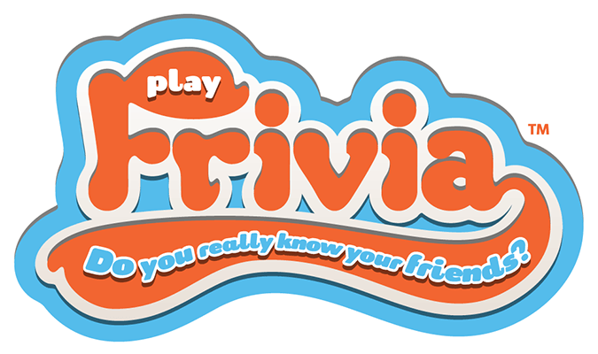
This was the First Frivia Logo.
I had been designing for this game called Frivia. I had two ideas, a swoosh like on varsity tee shirts and a pompadour hump on the "F".
I've been having a orange & blue fixation that I can't seem to shake.
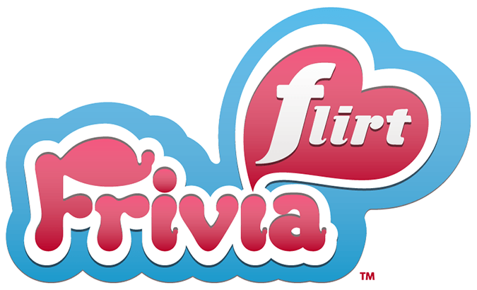
The Intermediate Logo
I was trying to get away from the orange and blue. The swoosh seemed a bit busy, so I tried a heart. I redesigned the serifs. The original seems random and haphazard. Now they look like drips that float up.
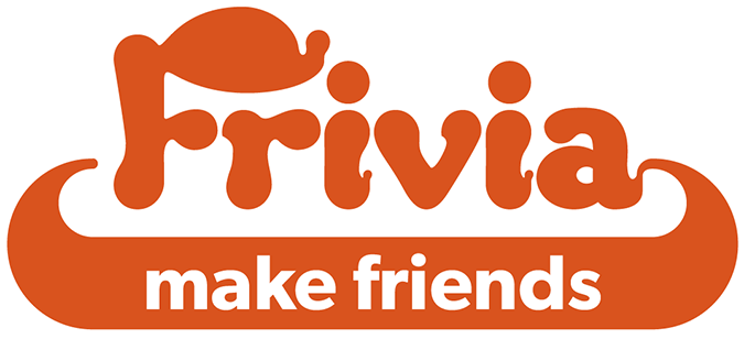
Almost There
I brought the swoosh back, but evened it out. I really needed a shape that I can put text in. I finally killed the blue. It was a slow painful death.
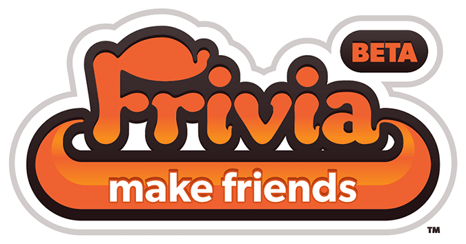
The Final Logo
I made the palette closer to the
Robot Sheep Games corporate palette. The dark brown made it easier to read, especially as a small logo.


Comments
Post a Comment