This is my job. I write pitches.
The Original Logo
I had this corporate pitch writing gig and was given this logo to work with. It was okay, but I wasn't big on the font and thought it needed to be more modern and space-aged.

The Revised Logo
The new font was more modern. It made for a good banner for web and it still had the "networky" feel of the original.

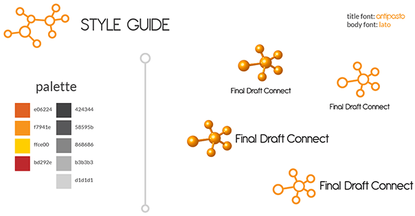
The Style Guide
It wasn't a total redesign, but since I was involved with the product before product launch, I refined it a little, just so I had more elements to design with. The 3-D logo is for product and the flat one is for corporate collateral.


Comments
Post a Comment